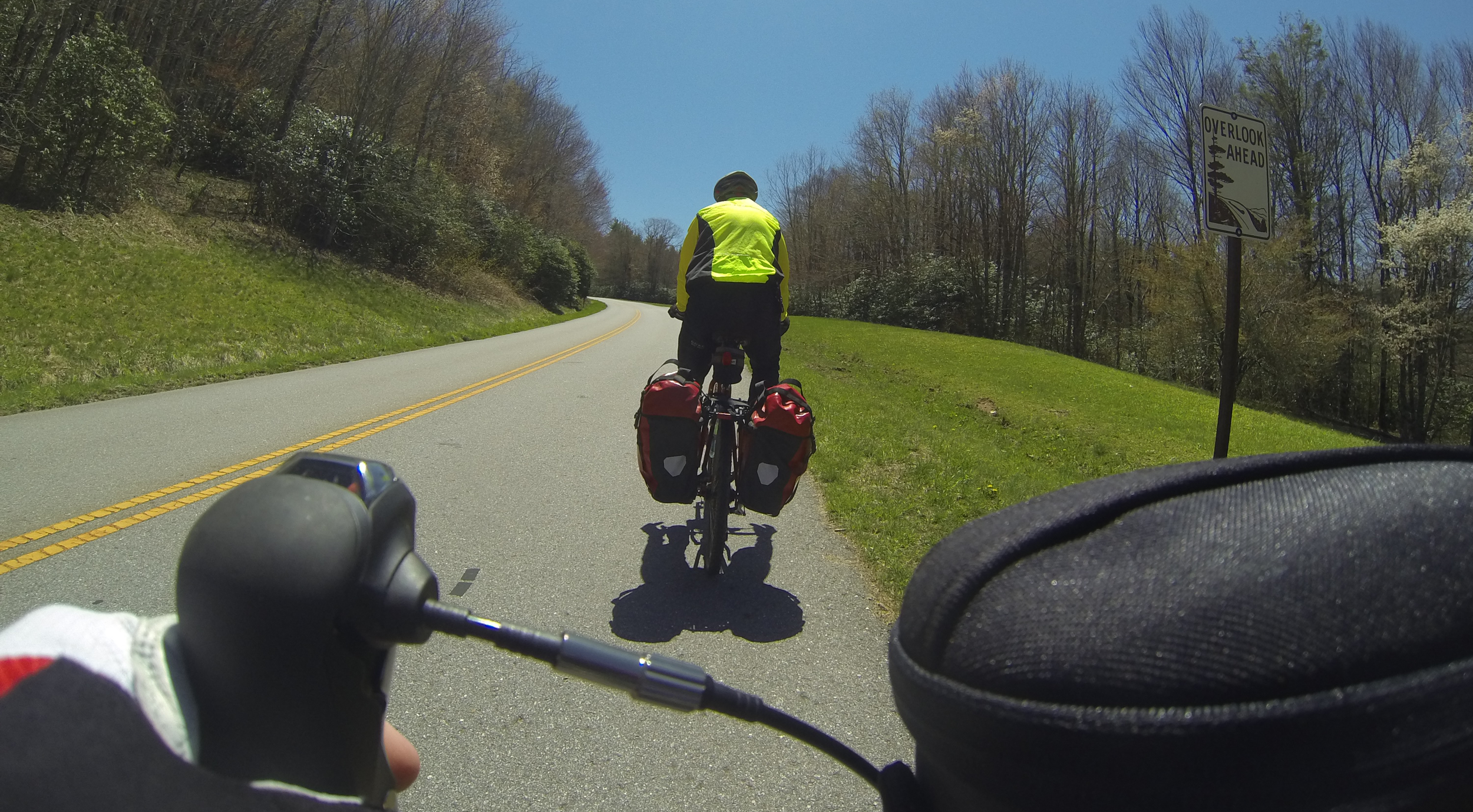


First of all, there is no substitute for designers sitting with research subjects, not behind the glass and certainly not just reading the report. There's no substitute for using competitive products and becoming an expert (if you can) in the category. And certainly once you start making hardware, you've got to be obsessively using it and learning and improving it. This was a shot during a 120+ mile trip in the mountains where I tested bike computers vs our product. So re process, a lot of experience planning is helpful. But if you aren't obsessively building & using your own, it doesn't matter.
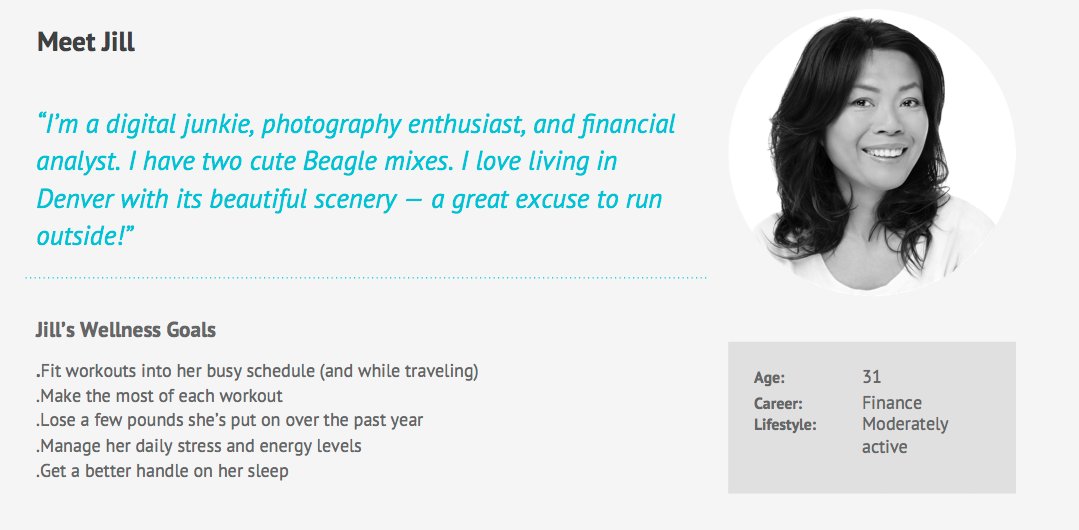
Personas are controversial, but I’ve found them to be useful in creating tangible, personal archetypes that you design for. If nothing else they get the larger team on board & they help with designers who join the team later on. Work needs to happen prior to creating them so that they are both real & cover the majority of the users that you’ll be designing for.
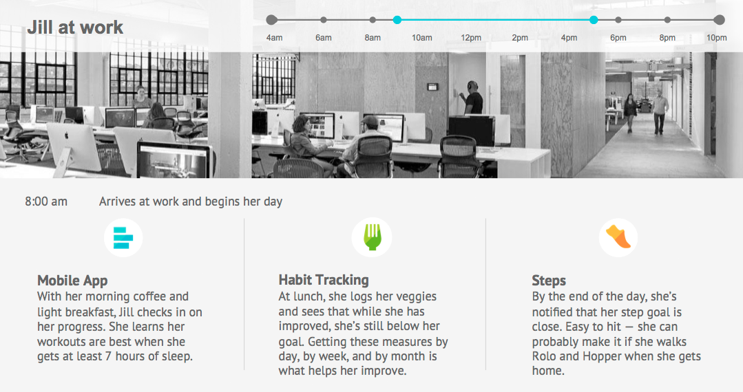
From personas we get scenarios of that person’s life & daily regimen. Again, an internal tool that helps “kick the tires” on what we are designing & why. It’s also very useful for justifying direction to other teams & senior leaders, & even customers. We spend the time to do these things prior to design so our direction is true. And none of these tools are antithetical to agile, or have to happen outside of sprints. All of this process work was done within a dual-track scrum framework.
These kind of tools are great for gut-checking what’s really going on with whatever experience you are trying to design. First you have to somehow observe & engage with the targeted consumers to understand the space. But then you have to boil those observations down into a few salient points, a simple story. The blue line is the simplistic, naïve way of thinking about fitness. The teal colored line is what life is actually like, full of ups & downs, & later on in life for most people the trend-line is downward. This is critical to understand in order to make an experience that’s effective. Another observation is that the experience should behave differently when the person is on an upslope where momentum is building on itself, vs when they start a down slope & need more encouragement to just stop the slide.
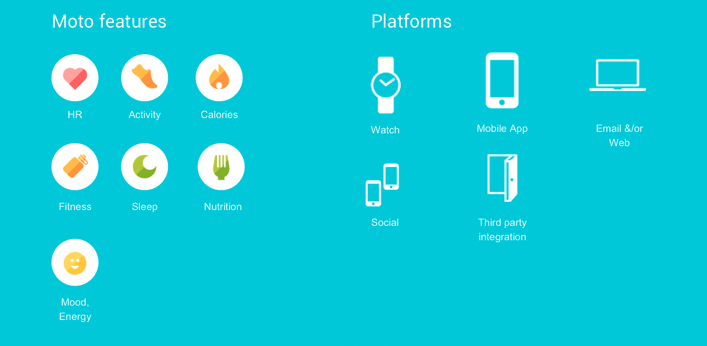
It's important to not only know what your MVP is for shipping, but also what your larger plans are. After extended research as well as time with users we realized that in order to shape someone's wellness you needed all 4 of these categories, not just a person's activity level. We spend time working on horizon's of experiences, where we plan for the next few years of experience planning.
We make sure that we maximize the different platforms at our disposal & release new experiences across them. Our working model is that experiences scale with the size of displays & the way people consume information. From small to large: bite, snack & meal. We lean on email & desktop for larger messages & scale all the way down to the Moto 360 which is based on 5 second interactions.
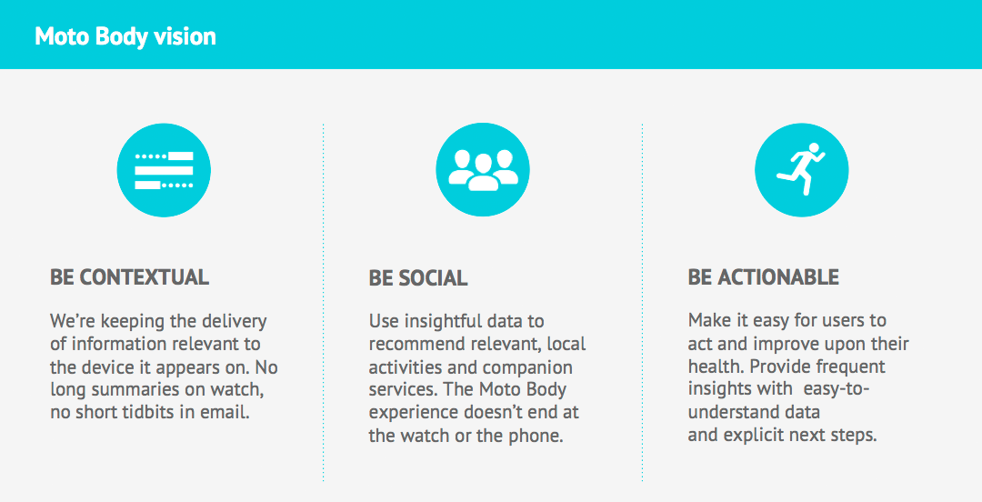
We have design attributes at Moto that we adhere to in all our work, whether that be about simplicity or delighting users. But this is about what we want to deliver for this specific experience, in this case our health & wellness app called Moto Body. Through our long history working on MotoACTV we learned a lot about different kinds of athletes, & Moto Body was trying to reach waht we called fitness seekers. We capped the experiences at potentially training for a 10k, but typically more like a couple mile run or long walking. This has implications on battery size, display type, etc., not just app features. We focused on being appropriately contextual across platforms, leveraging social for motivation, & being action oriented toward achieving daily goals.
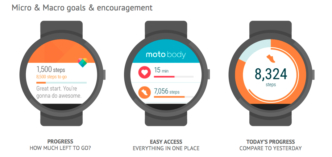
Our design first of all focused on designing for a round display, not squares & rectangles. We then wanted to motivate in quick interactions, & part of that is always comparing today to yesterday. We ended up with a simple, clear & differentiated health & wellness experience which we leveraged into fitness for our fitness focused products.
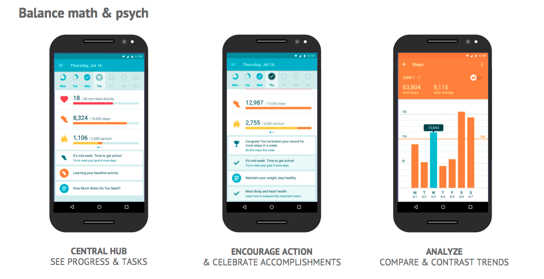
Now with a larger display & experiences that are for when the user has more time, we created dashboards showing progress & rich graphs. We also built in our learning algorithms which worked to personalize the experiences for each individual. We spent months working with our engineers to figure out trends & how we could provide value by recognizing them & calling for action.