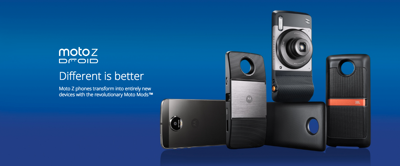
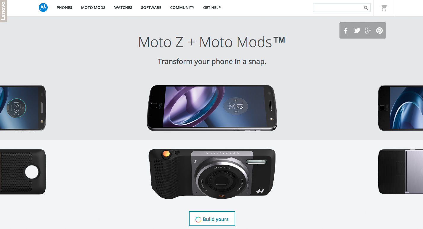
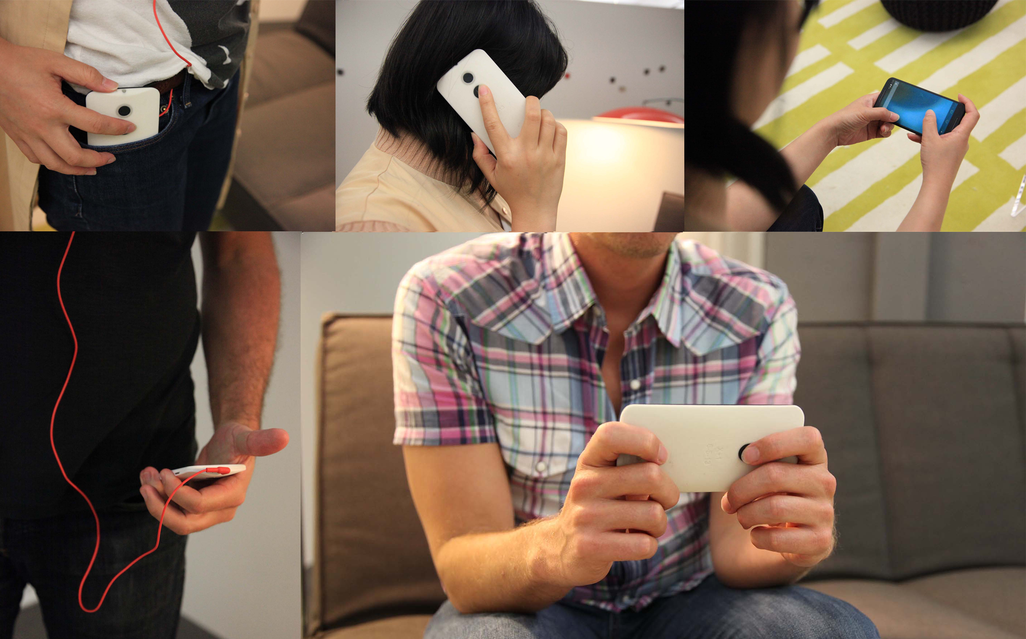
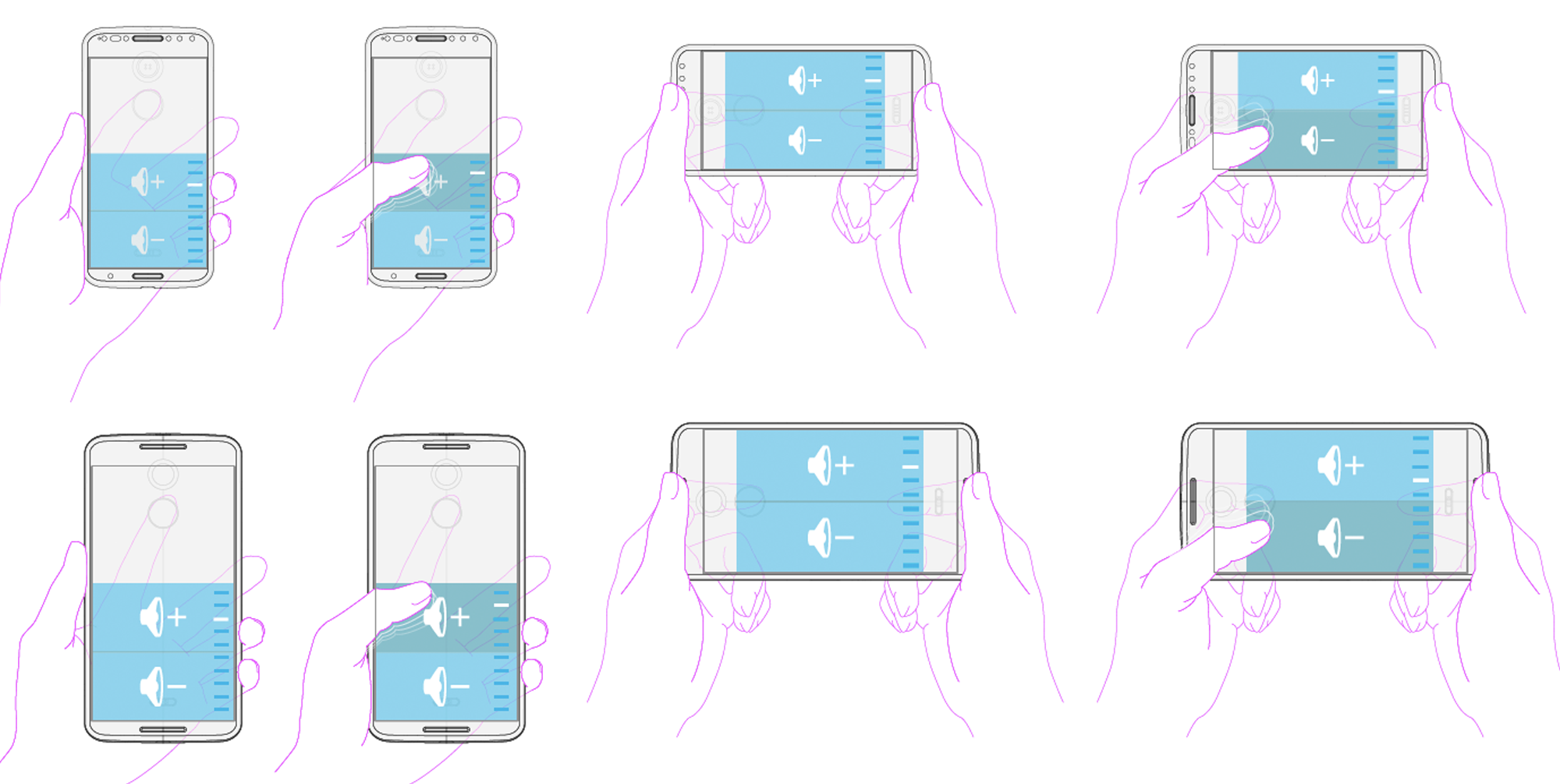
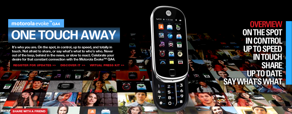
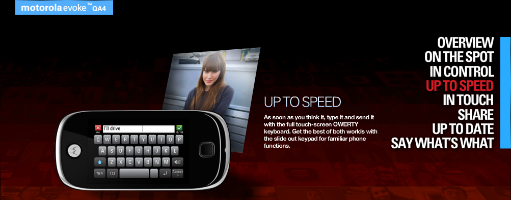
ux: Mobile
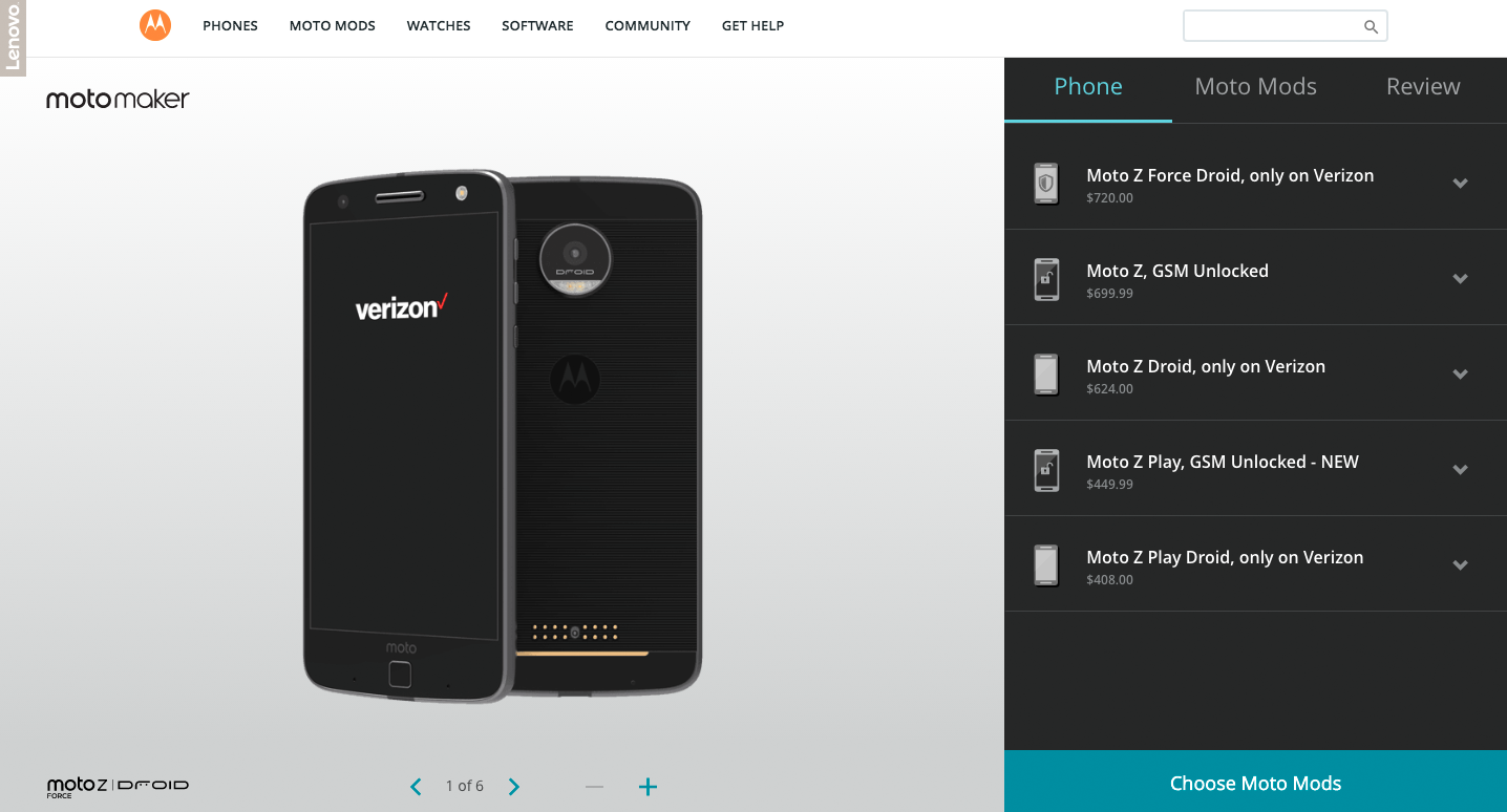
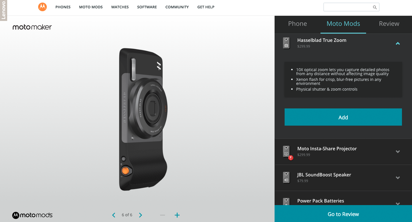
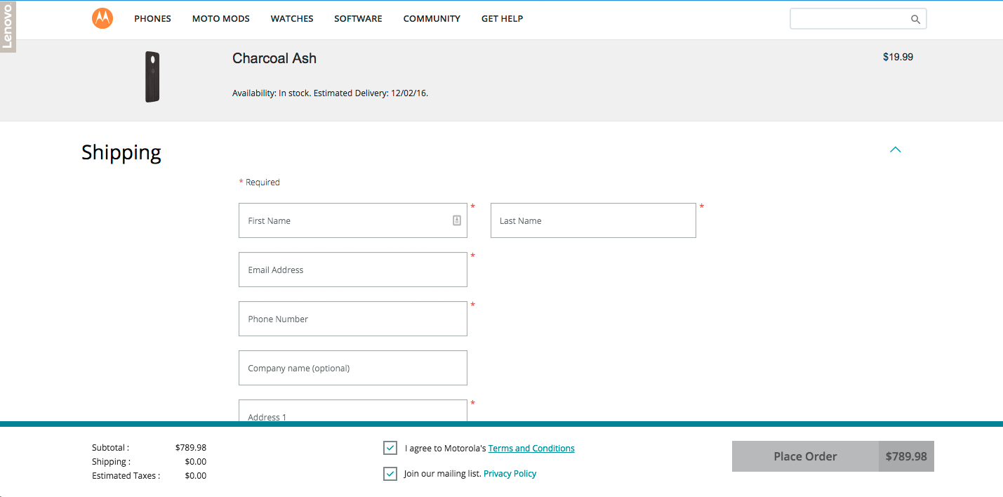
I started at Moto designing everything from disco lights on phones to status bar icon prioritization tables. on to RAZR, then creating our first cap touch platform, & then differentiating on Android. I was also responsible for our responsive web design, phone customization tool, & cart + checkout.
RAZR
An oldie but a goodie, & arguably one of the most iconic phones of all times. My team helped design the laser cut keyboard shapes & characters, & I directed the UI skins we created specifically for the RAZR franchise. As old as this product is, & even though my part was relatively small, anyone who was involved in it is still really proud of it.

moto mods
More recently I've led the Mods platform design, which strives to create a lightweight, consistent approach for all Mods whether internally designed, done in conjunction with a partner like JBL or Hasselblad, 3rd parties or even some kids in a garage. Consistent & simple attachment, setup, access to battery & settings, & treatment of partner apps. One of the greatest challenges you face in a company that has an engineer driven culture is to constrain all the things that we could do down to the things that consumers want us to do. Making simple things requires a lot of saying no, and we successfully did that with these product experiences.

motomods.com “flipbook”
My team was tasked to design the web page for Moto Mods. The biggest challenge was to show/tell what they are, since it’s such an unusual & new product. We used the idea of a child’s flipbook as a way to show both the Mods compatible phones as well as all of the options for Mods. Each section animates quickly back & forth & when you pause in the middle they snap together. You can then either share your favorite combination on social, or start the purchase process by launching our customization tool, Moto Maker.

motomods.com social
Our marketing team wanted to launch a social campaign site which we would link to. We decided to chunk out our page topically & prioritize from top to bottom. We started with flipbook, then had an interactive FAQ section because we found through research that people had a lot of questions about backwards compatibility, etc. Below that we had lifestyle photos & stories, & then this social section where we had a section for the hero quote plus a variety of quotes across platforms. One of the reasons this section is worth noting is it led us into rather fierce debates about the how mediated the social would be that we posted. Design pushed for an open stance on social & we win by making great products & experiences, but the ultimate decision was to be pretty highly mediated.

motomods.com portfolio
This section is a pathway into either the product page of each phone & mod, or toward cart & purchase. We needed to succinctly summarize the KSP’s of each device & chose to put the actions on rollover to keep it from getting too cluttered. We extensively tested each section, as well as tracked user traffic once live. We A/B test any ideas on how to improve the site & conversion, which mainly consisted of content refreshing, action button updates, & moving different sections up or down the page.

Motomaker moto z
My team was also responsible for Motomaker.com, our web customization tool. The Moto Z franchise introduced a new challenge for MotoMaker in that it was the first time we were matching phones with mods, & so we had to present multiple phones within a flow that was designed for one. This is a view of our phone tab.

Motomaker mods
This was our first introduction to adding Moto Mods to Moto Maker where we weren't just customizing a phone, but adding a mod as well, some of which can be a couple hundred dollars. So we had to make a new tab just for mods, where you could see each one as well as get a description of the KSPs. We also then have a summary tab where you can review your selections before moving to the cart.

Motorola.com cart & checkout
We spent a lot of time testing & improving our purchase path through AB testing. This was our new form which added expanding & collapsing categories as well as a sticky summary footer. We iterated on colors, layout, language, etc., as well as then study the traffic & heat map per section & page.

motomods dev portal
Our engineering team was going to publish a site for developers, a place for technical details as well as where you could order hardware & download the SDK. The site was a bit rough, so we helped with all of the diagrams. We spent a lot of time with our engineering team to both understand what was important to be conveyed, as well as using them as the developer audience to see if we had achieved what was needed.

MOTO X INNOVATION
One of my favorite things to do is work on product innovation, but not on "paper". This is a study I led re how to improve fingerprint sensor location & perhaps volume on a couple product sizes. After personas, scenarios, & benchmarking, we quickly got to ergonomic studies with models.

MOTO X INNOVATION
We created quick models of how the interaction could work, either all on the back or, as is shown here, back + front interactions. You're not worried about the final solution here, just quick prototyping & learning. We then hacked older generation phones & created working models which we tested with consumers. This one of many products I've worked on re innovation via software + hardware prototyping. In the end with this one, our FPS vendor kacked on us. One of those many crap stories in the bare-knuckled world of IP...we had a great vendor prior, but chose not to purchase them. Apple did. We ended up losing 2-3 years before we found a reliable enough solution again.

EVOKE touch platform
This was my first breakthrough assignment at Motorola. As leaks began to build about the iPhone, our company scrambled to respond. The strategy was to draft off of the iPhone with a more affordable, phone-first offering as a bridge product. So we built our first cap-touch device in linux-java, from the ground up. All applications & operating system & I led the entire design team, which was large. It was complete with peers, people senior to me, & folks who couldn't stand each other.....! Truly a learning experience both in design & management. We delivered a compelling product.

EVOKE modularity + input
One of my favorite areas of innovation, & first time messing with accelerometers & gyros, we created 3 states of input: Product vertical slider in, product vertical slider out, & horizontal QWERTY. The transitions were tied to the state change, which was kinda cool back then. It was a small screen so optimizing the touch targets, gutters between, & display edge accuracy required a lot of focus & refinement.

EVOKE social
We were just catching the beginning of the wave of social, especially social on mobile. It was fun to work through the use cases of sharing media, linking to camera & websites, & how how you would be notified of new content. Plus everything was based on touch & gesture, such a different & more interactive paradigm than the indirect manipulation (5-way nav) of the prior 5-10 years.