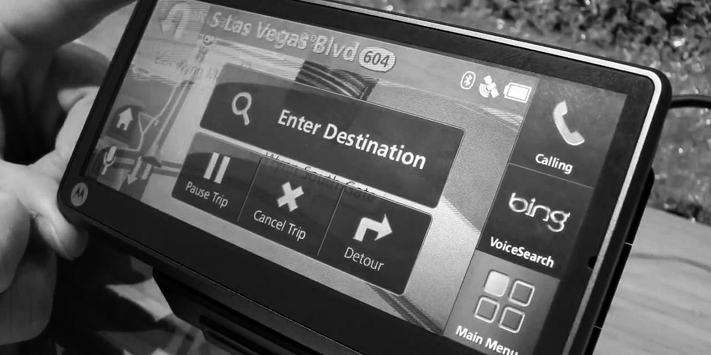
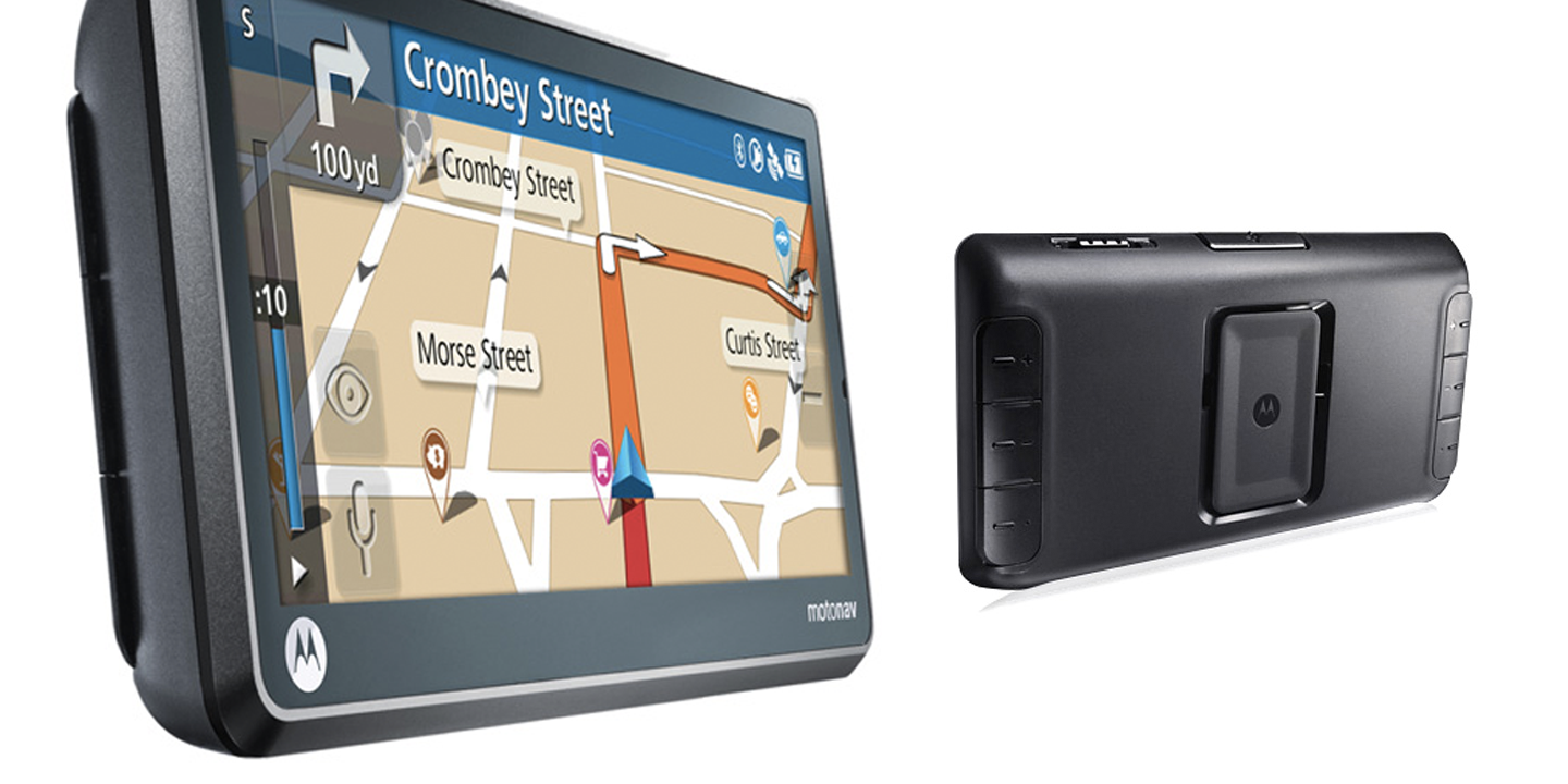
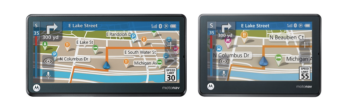
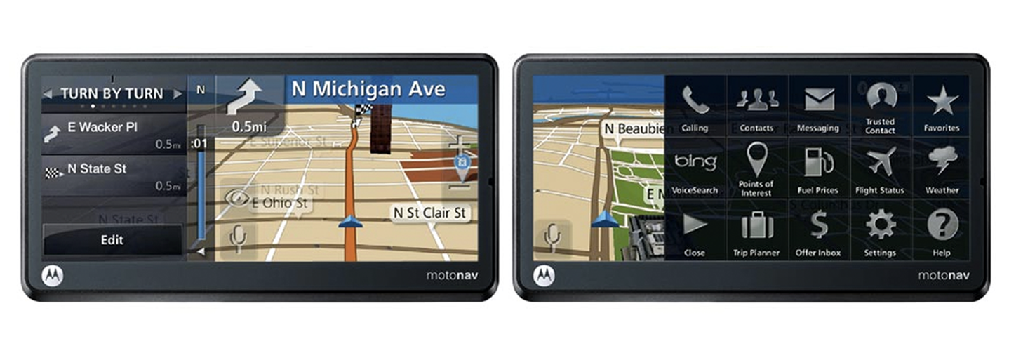
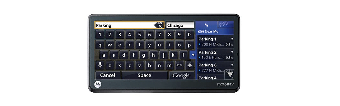
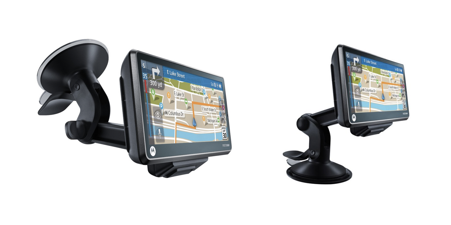
MOTONAV was Motorola's navigation brand of products. My main impact was on the TN500 & 700 as I led the complete UX design. We built an entirely new navigation UI for this platform which scaled across display sizes. The 700 was a fully connected, wide screen device, & The 500 was the lower tier, stand-alone & smaller screen.

tap to start
In order to show off the display, as well as optimize for every-day driving w traffic on, our homescreen was a clean map. Tapping once brought up the Start trip button, in trip controls, & access to main to the main menu panel on the right. Tapping off cleared the menu back to the map.

hard key interaction
The devices had very interesting hardware & needed to be used under the duress of driving. Hands on the wheel & eyes on the road was our mantra.....but voice wasn't quite there yet so there was a fair amount of interaction with the device. Primarily a quick way to get back to map which was an easy to feel/hit top button. And we were inspired by F1 paddles shifters which we thought would work well for volume & mute. Because we were also shipping to the UK & other right side driving regions, we concluded we needed the shifters on both sides. We then allowed for customizing the actions via the UI.

scalable
We focused on innovating on our higher-tier, cinematic display devices, but the design also had to scale down to the more common display size of the TN500. And the lead products both shipped at the same time. So we optimized the side panel behavior & viewability on top of the map for the wider display, & scaled back on that feature for the smaller. Map viewing, turn by turn, app launcher, & QWERTY input all had extra side panel features on the wide device, without hampering usability on the smaller.

panels
In order to keep the map as clean as possible & your route as visible as possible, we leveraged some older conceptual phone work I had done & made these hide/reveal panels. We went with an etched glass look & feel to further enhance the impression that you never left the map (this was quite a bit before the skeuomorphic debate, & while I might now tamp down the etching, it still holds together well). The left panel was only available when you were navigating, & had optional views of turn by turn, traffic, POI's, & a thumbnail map of the final destination/s. The right panel was packed with features like trip planning & flight data, as well as all the BT phone functions like calling & contacts.

input
This was another great area for innovation. We tested & tested this point & shoot touch model on more of a 3ft interaction model rather than in-hand...making accurate touch targets was no easy feat. We also saw an opportunity on the cinematic display to show predictive text with each character input, & once our algorithm was confident enough the right panel had a spring-loaded behavior to expand over the keyboard in order to make selection easier. This was also just the beginning of voice input via Google so that feature was added as well. We also used this blue color to differentiate from the grey when predictive was high enough, or it was time to turn...anytime we had a highly important cue.

testing
Our ID team was responsible for the final decisions re materials & physical design...but I strongly believe in testing ID + UI & steering all decisions. It's all UX. So I drove & drove to learn about the UI as well as give input as to the reach on my windshield, glare so we got the right display coating, whether or not the suction cup was working, if the device was staying docked regardless of how rough the road was, etc.